Urban Big Data Analytics
Lecture 8Data Visualization + Web Mapping
July 29, 2019
Instructor: Andy Hong, PhD
Lead Urban Health Scientist
The George Institute for Global Health
University of Oxford
Pop Quiz
- Prep for 10 minutes
- Key materials we covered so far
- Principles and key elements
- Being able to explain terms
Answers to the Quiz
Assignment 4 out
- More hands-on training in R
- EDA and visualization
- Send your R code along with your plots
- Assignment 4: link
Data Visualization
What is data visualization?
- Representing data in a graphical format
- Transforming numbers into visuals
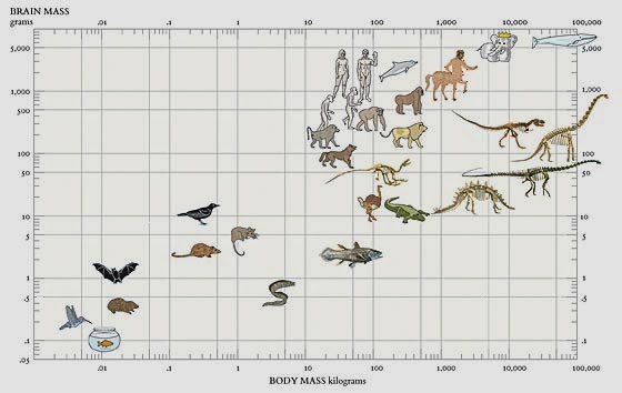
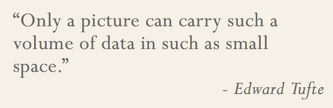
- Good graphics are simple, intuitive, and yet tell a complex and powerful story
- Bad graphics are clusttered, embelished, and yet convey little and simple information
Typical activities in a day
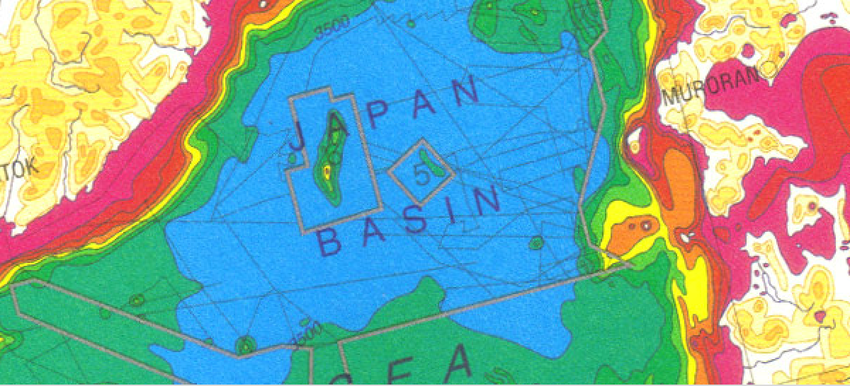
New York Times graphics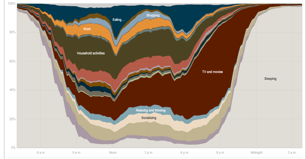
The rhythm of food
http://rhythm-of-food.net/peach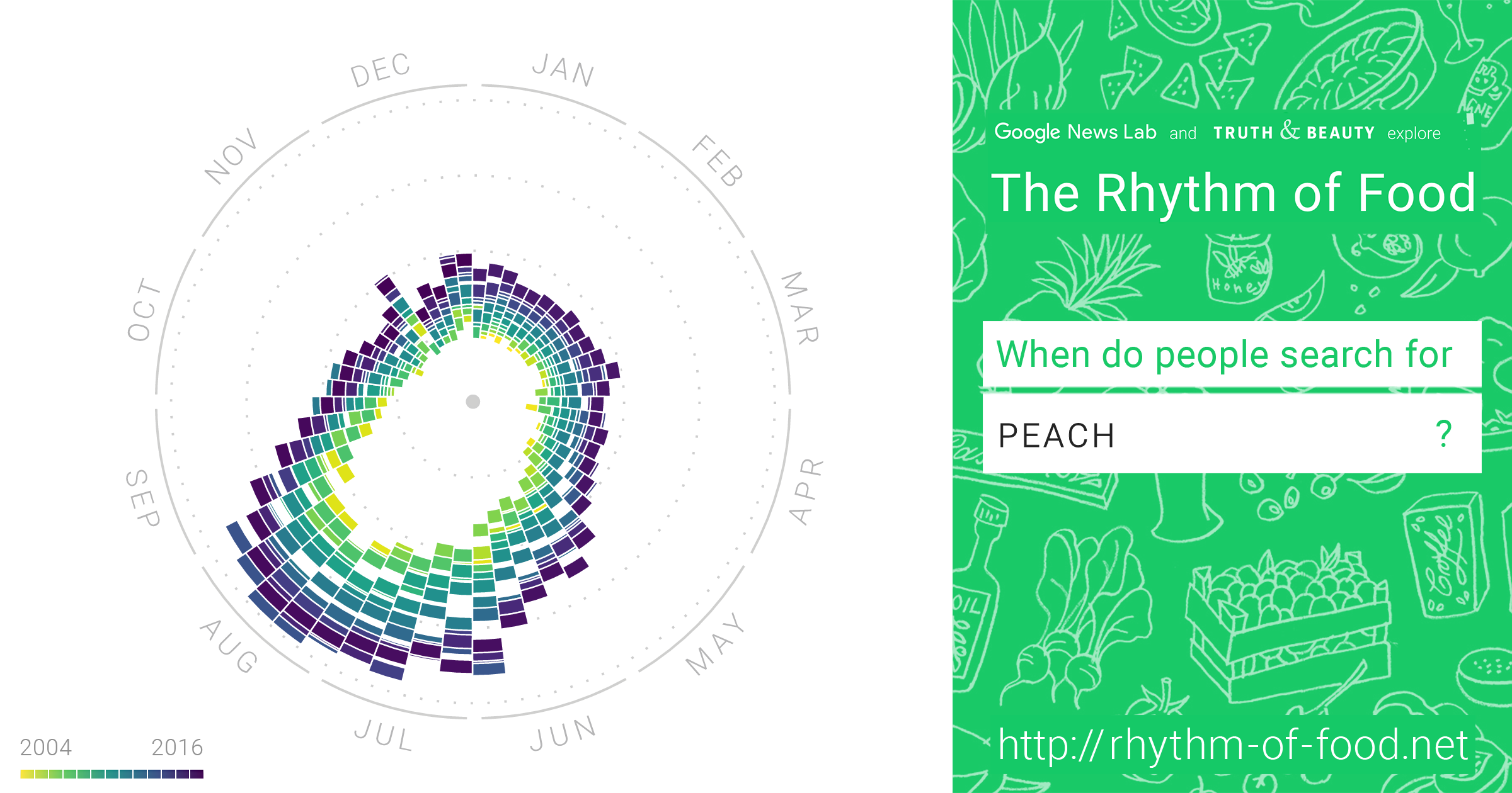
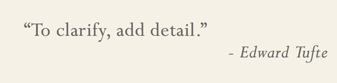
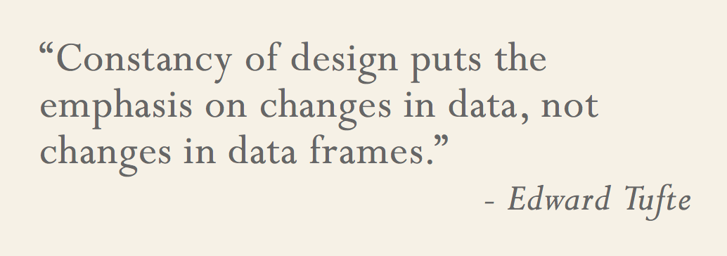
Tufte's 10 Rules

- Edward Tufte - Yale professor
- Living legend and expert in data visualization
- "The da Vinci of data"
- "Chart Master"
- "The Data Artist"
10 rules adapted from sealthreinhold.com
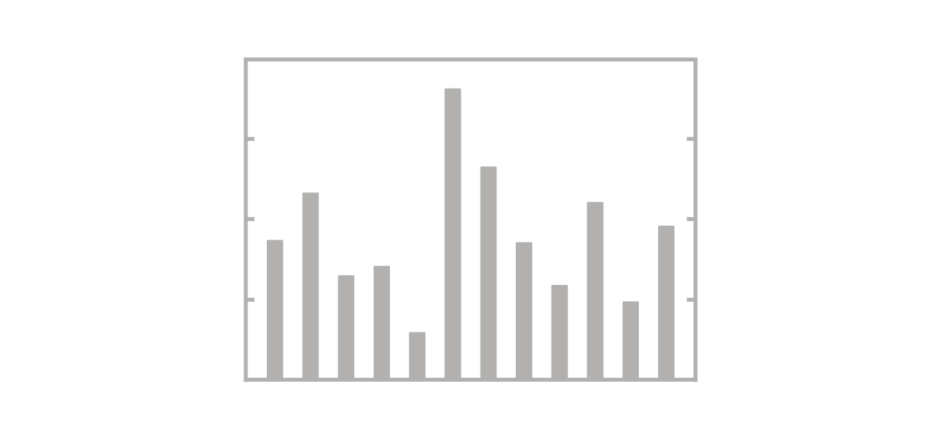
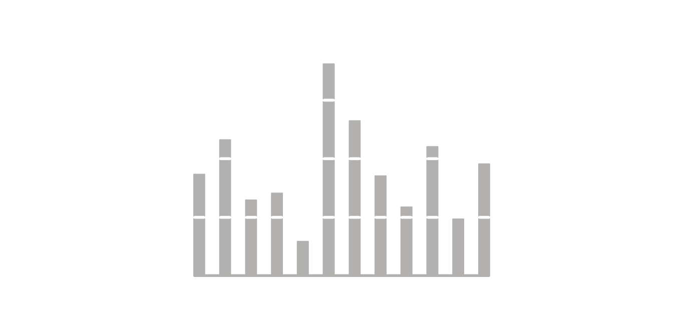
1. Show your data
2. Use graphics
3. Avoid chartjunk
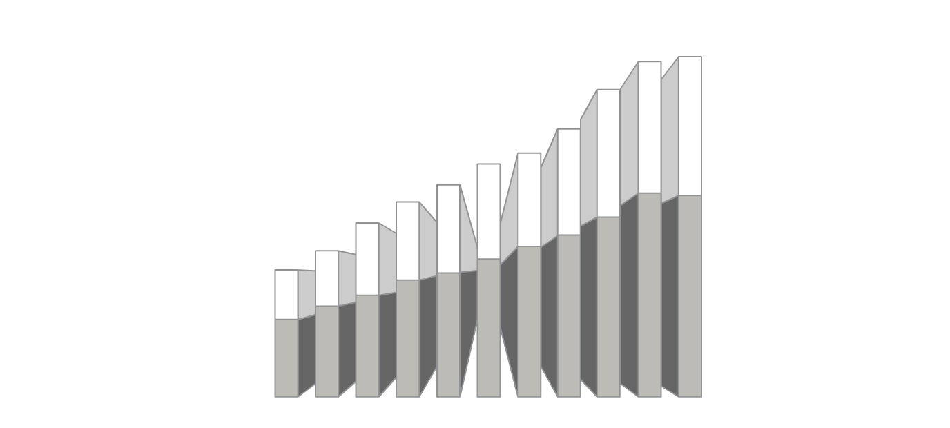
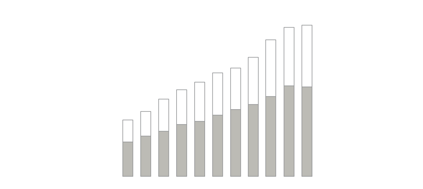
4. Utilize data-ink

5. Use labels
6. Utilize micro/macro
7. Separate layers

8. Use multiples
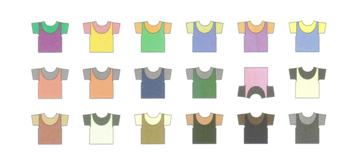
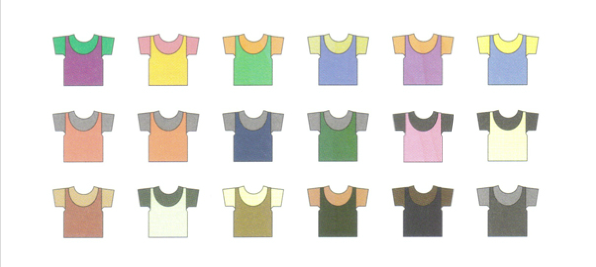
9. Utilize color
10. Understand narrative
Visualization in R - ggplot2
				# Initialize a plot
				ggplot(data, aes(x = x, y = y))
Visualization in R - ggplot2
					# Histogram
					ggplot(data, aes(x = x, y = y) + geom_histogram()
					# Scatter plot
					ggplot(data, aes(x = x, y = y) + geom_point()
					# Adding a trend line
					ggplot(data, aes(x = x, y = y) + geom_point() + geom_smooth()
					# Box plot
					ggplot(data, aes(x = x, y = y) + geom_boxplot()
Interactive mapping in R - leaflet
					# Initialize a map
					leaflet(data) %>% addTiles()
Interactive mapping in R - leaflet
					# Add markers
					leaflet(data) %>% addTiles() %>%
						addCircleMarkers(~long, ~lat)
					# Visualize data
					leaflet(data) %>% addTiles() %>%
						addCircleMarkers(~long, ~lat, radius=~value)
					# Add colors
					leaflet(data) %>% addTiles() %>%
						addCircleMarkers(~long, ~lat, color=~value)
					# Add labels
					leaflet(data) %>% addTiles() %>%
						addCircleMarkers(~long, ~lat, label=~label)